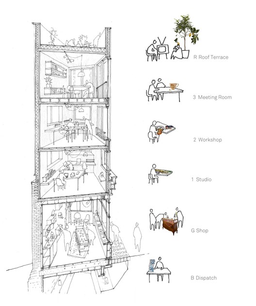
Alex Monroe Studio / DSDHA
This section portrays the program and activities that are expected to take place in each of these floors in a whimsical way due to its people and hand drawn nature. I think the use of color selectively on the right and the overall sketching creates a clear style. The way the building is portrayed also reads spatially, not so much interconnectivity, but how each floor functions for a specific usage.
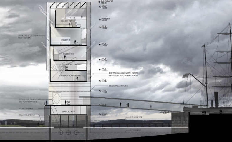
V&A at Dundee / Steven Holl
This use of coloring and shading makes this section look dynamic and helps to tie the drawing to the surrounding context and atmosphere. The rendering of the interior spaces helps to reinforce the lighting design strategies being used here. It would’ve been less effective if the daylighting was noted but the interior spaces were left blank and shadowless.
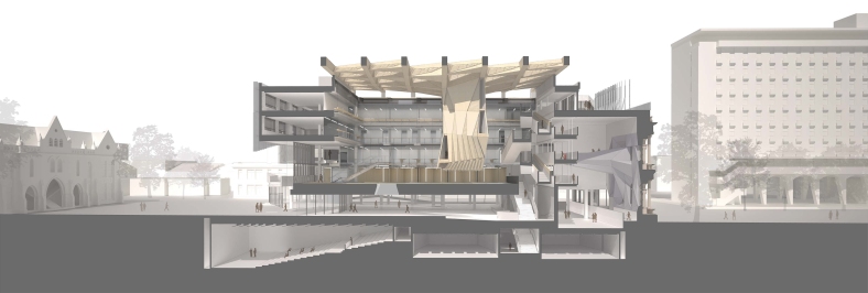
Melbourne School of Design University of Melbourne / John Wardle Architects + NADAAA
This section clearly conveys the spatial quality and relationship between different spaces within. It makes it easy to understand how the building is laid out and centered on a central atrium space. I feel like the way this section was rendered is effective in showing the connection between interior and exterior without being too distracting. It also begins to show how daylighting will illuminate some interior spaces.
